How to Animate Buttons in Figma
A complete tutorial on building animated buttons in Figma. From component variants to patterns like loading spinners and success states.
How to Animate Buttons in Figma
A complete tutorial on building animated buttons — from the foundation of component variants to advanced patterns like loading spinners and success morphs.
A button is the smallest unit of motion design in a product, and it's also the unit that gets used the most. Every form has one. Every modal has one. Every navigation flow ends at one. The way a button responds to a cursor, to a press, to a successful submit, sets the tone for everything else the user perceives about the interface's quality. A perfectly designed flow with static buttons feels half-built. A modest flow with well-animated buttons feels polished.
The good news is that animating buttons in Figma follows a clear, repeatable pattern once you understand the foundation. The not-so-good news is that the foundation isn't obvious. Most tutorials jump straight to "add a hover interaction" and skip the structural decisions that make button animation actually scale across a real product. This guide covers the full picture: the component-variants foundation, the three essential states every button needs, the animation patterns that map to each one — hover, click, loading, success, disabled, toggle — and the workarounds for the well-known gotchas like the hover-plus-click conflict that trips up almost everyone the first time. By the end, you'll have a complete mental model for figma animation as it applies to buttons specifically, and a foundation you can extend to every other interactive component in your design system.
Before You Animate: The Component-Variants Foundation
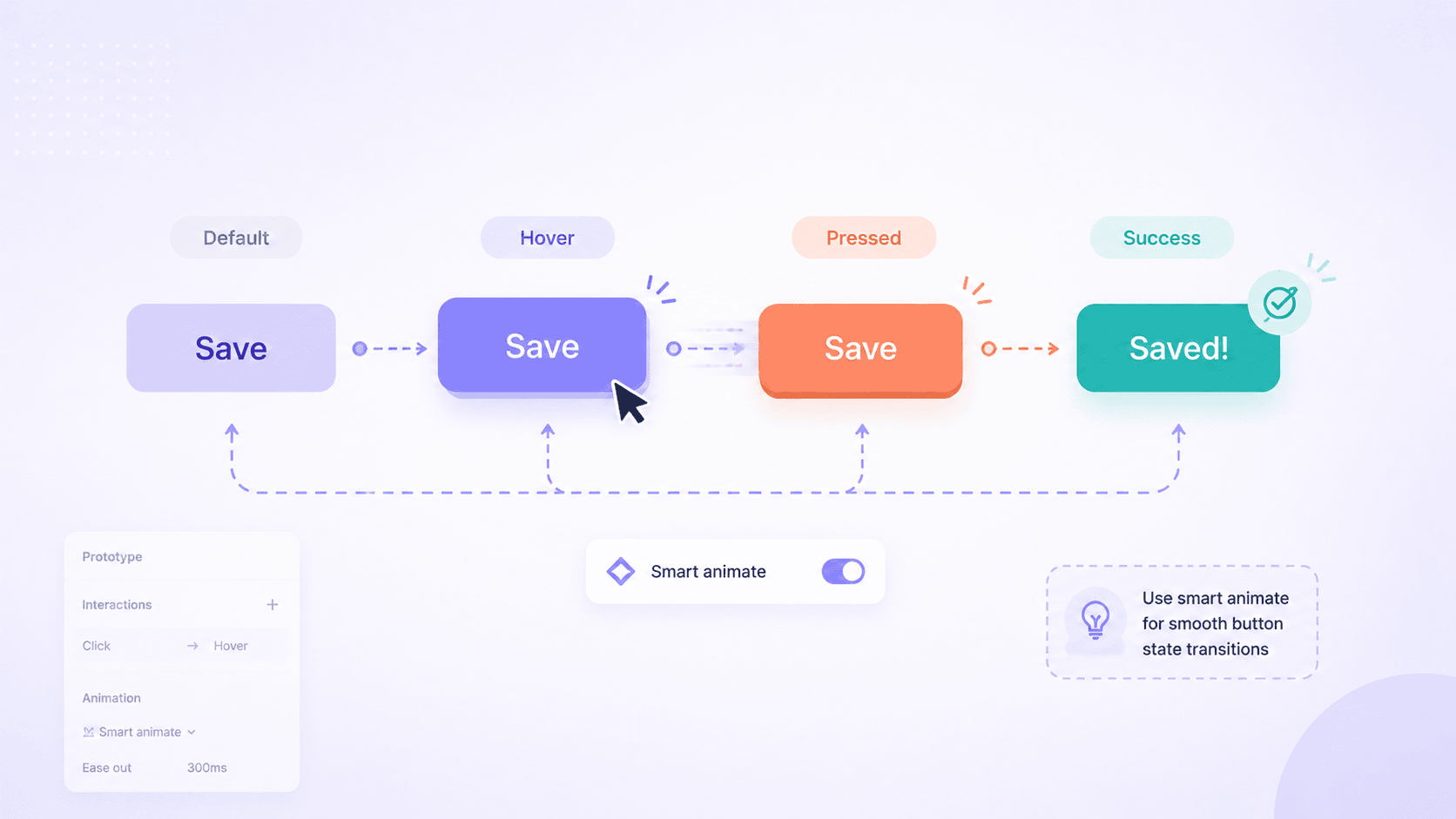
Every animated button in Figma is built from the same structure: a component with multiple variants representing different states, connected by prototype interactions. Trying to animate a button without using variants is possible but painful — you end up duplicating frames, breaking Smart Animate's layer matching, and rebuilding the same animation every time you need the button elsewhere. Variants solve all of this in one move.
Why button animation starts with variants
A variant is a state of a component. Default, hover, pressed, disabled, loading — each is a variant inside one component set. When you add an interaction like "On hover → Change to hover variant," Figma handles the transition between them using Smart Animate, which interpolates differences in position, size, color, opacity, and rotation. The whole animation is contained inside the component, which means the button works the same way every time it's used. Drop ten instances of the same animated button across a prototype and all ten animate identically with no extra work.
For broader context on how Smart Animate handles these transitions under the hood, the complete guide to Smart Animate covers the matching logic that makes variant-to-variant animation work, and the complete guide to Figma animation covers the broader animation system this fits into.
Creating your first button component
Start with a single button. Use Auto Layout (Shift + A) to wrap the text and any icon inside a frame so the button resizes cleanly with content. Set your padding, corner radius, fill color, and text style. Convert it to a component (Ctrl/Cmd + Alt + K or the diamond icon in the toolbar).
Once you have the component, click "Create variant" in the right sidebar. Figma duplicates the component and creates a component set with a property called "Property 1" by default. Rename this property to "State" — clear naming becomes important as you add more variants. Set the first variant's State to default.
Setting up the three essential states
For most buttons, three states cover the foundation: default, hover, and pressed. Disabled, loading, and success states are useful but optional depending on the button's role. Add two more variants by selecting the existing one and clicking "Create variant" again, then label them hover and pressed.
Style each variant to represent its state. The hover variant typically uses a slightly different fill (a few shades lighter or darker), maybe a subtle scale-up or shadow increase. The pressed variant typically uses a darker fill or a slight scale-down. The visual change between states should be perceptible but not jarring — too much movement makes the interface feel anxious.
How to Add a Hover Animation to a Figma Button
With the variants in place, the hover animation is the simplest figma animation pattern to set up — one prototype connection per direction.
Connecting variants with While Hovering
Switch to the Prototype tab in the right sidebar. Select the default variant in the canvas. A blue plus icon appears on the right edge of the variant. Drag it to the hover variant. A connection arrow appears between them and an interaction panel opens.
Configure the interaction: set the trigger to While hovering, the action to Change to, and the destination to the hover variant. Set the animation type to Smart animate, and choose an easing curve and duration. The connection is now live.
Add a return connection going the opposite way — from hover back to default — using the same While hovering trigger. This is the connection that makes the button animate back to default when the cursor leaves. Without it, the button stays in the hover state after the cursor moves away, which feels broken.
Smart Animate vs Dissolve for hover transitions
For button hover effects, Smart Animate is almost always the right choice. It interpolates the differences between states smoothly: a fill color shifts from one value to the next, a scale change from 1.00 to 1.02 happens gradually, a shadow grows or fades naturally. Dissolve simply fades one variant over the other, which loses the motion that makes animated buttons feel responsive rather than just visually different.
The one case where Dissolve makes sense is when the hover state has no shared properties with the default state — for example, if the entire fill swatches and content layout change dramatically. In practice this is rare for buttons, which usually keep most properties stable and animate only a few.
Timing and easing that feels natural
Figma's own design guidance recommends keeping button-level animations in the 150-300ms range. Faster than 150ms feels abrupt and the animation barely registers. Slower than 300ms starts to feel sluggish, like the button is reluctant to respond. The sweet spot for most button hover effects is around 200ms with an Ease out curve — fast initial response, gentle settle.
For pressed states (where the user has taken an action), even shorter durations work better. Around 100-150ms feels immediate, which is what a click should feel like. The brain processes a button press as instant feedback; an animation longer than that breaks the illusion of direct manipulation.
How to Add a Click Animation to a Figma Button
The click animation is what tells the user their action registered. Without it, users sometimes click twice because they're not sure the first click worked.
Mouse Down vs On Click — which trigger does what
Two triggers matter for click animations. Mouse down fires the moment the user's mouse button or finger touches the surface, before the click is released. On click fires when the click completes. For the pressed state animation, Mouse down is the right trigger because the goal is to show feedback during the press, not after. The natural pattern: Mouse down → Change to pressed variant; on release, the button animates back through hover (if the cursor is still over it) or directly to default (if not). This gives the "press in, release out" feel that mimics physical buttons.
Creating the press feedback
Press feedback is usually one of three styles: a slight scale-down (from 1.00 to 0.96), a darker fill color, or a depth shift (shadow reduced or removed to suggest the button is being pushed into the surface). Scale-down is the most universally recognized; users intuitively understand it as a press because it mirrors how physical buttons compress. The compression should be subtle — scaling to 0.96 is more readable than scaling to 0.90, which starts to feel exaggerated.
Combine the scale with a slight darkening of the fill for the strongest effect. Both changes happen in the same 100-150ms transition, giving the impression of a single coherent press response.
Returning to default state after the click
The cleanest pattern is to wire pressed back to default (if the cursor has left the button) or hover (if the cursor is still over it) on the Mouse up trigger. The transition back to default uses Smart Animate with a slightly longer duration (around 200ms) so the release feels gentler than the press. This asymmetry — fast press, slower release — matches how physical objects respond and feels right without anyone consciously noticing why.
Animating Icons and Labels Inside Buttons
The button's outer shape is only part of the animation. Icons and labels inside the button often need to animate too, especially for state changes like save → saved or play → pause.
Icon swap animations
The save-to-saved transition is the canonical example. The default state has an outlined heart or bookmark icon; the saved state has the same icon filled. To animate cleanly between them, the icon needs to be the same component in both variants, with only its internal fill property changing. Smart Animate then interpolates the fill, which produces a smooth color shift rather than an instant swap.
For icon shape changes (a play triangle morphing into a pause square), the trick is to use the same number of vector points in both states with the points repositioned. Smart Animate can interpolate between identical vector structures but cannot interpolate between vectors with different point counts; the latter falls back to dissolve, which looks like the icon is fading rather than morphing. For deeper coverage of how these microinteractions work, mastering animation in Figma for better prototypes walks through the patterns in detail.
Label transitions and text content limitations
One important limitation: Smart Animate does not animate text content. If the button label changes from "Save" to "Saved," the text snaps instantly even if everything around it animates smoothly. The workaround is to duplicate the text layers (one per state) and animate them with opacity rather than swapping content. The "Save" text fades out as "Saved" fades in, both layers occupying the same position, with opacity transitions handled cleanly by Smart Animate.
Spacing changes during state transitions
Buttons using Auto Layout will automatically reflow when content size changes — adding or removing an icon, expanding a label. This reflow looks great in Smart Animate when the layer names match across variants. When they don't match, the reflow becomes a jump. Make sure icon containers and label layers have identical names in every variant, and Auto Layout handles the rest.
Advanced Button Animation Patterns
Beyond the foundational hover/click/release cycle, several patterns add more meaning to specific button types.
Loading state with a spinner or progress indicator
The loading state replaces the button's label and icon with a spinner while an action is in flight. The transition from pressed → loading should feel like a continuation of the click, not a separate event — same duration, same easing direction. Inside the loading variant, the spinner itself is usually built as a separate component with its own rotating animation, dropped into the button as an instance.
A cleaner alternative for users who don't want to build the spinner from scratch every time: the FigAnimations figma animation component library includes loading and progress animations built specifically for drop-in use inside buttons and elsewhere. Layer naming and structure are already correct, which means the transition from the button's pressed state into a loading state animates smoothly without manual setup.
Success state with a checkmark morph
The most satisfying button animation in modern interfaces is the success morph — the button transforms into a checkmark after the action completes. The pattern: loading → success is wired with Smart Animate, the spinner fades out while a checkmark fades in (or, more ambitiously, the spinner morphs into the checkmark using vector interpolation). The success state typically holds for around 1.5-2 seconds before either reverting to default or hiding entirely if the action navigates away.
Disabled state with reduced opacity and color
The disabled state isn't usually animated, but it's worth including in the variant set. When a button toggles from enabled to disabled mid-flow (for example, after a form submission), animating the opacity change from 1.00 to 0.5 over 200ms communicates the state change without requiring the user to notice it themselves.
Toggle buttons and switch animations
Toggle buttons are a special case: they have two semantic states (on/off, dark/light, mute/unmute), and the animation needs to communicate the toggle action itself. The standard pattern is two variants (on and off) connected with On click → Change to in both directions, animating the indicator's position from one side to the other while the background fill shifts. The animation duration here can run slightly longer than a button press — around 250-300ms — because the toggle is a state change, not just a press response.
The Hover + Click Conflict and How to Work Around It
This is the issue almost every Figma user hits at some point. You build a button with a hover state inside the component using variants, then try to add an On Click → Navigate To interaction on top of it in the prototype. The result: either the hover stops working, or the navigation stops working, depending on how Figma resolves the conflict.
Why hover and navigate don't play well together
The root cause is that variant interactions live at the component level, while frame-to-frame navigation lives at the prototype level. When both exist on the same button, Figma has to pick which interaction takes priority, and the result is sometimes unpredictable, especially when the click trigger is the same as a variant's trigger.
The three-variant workaround
The widely-shared community workaround is to add a third variant — call it active or selected — styled identically to hover. Wire the connections like this: default → hover on While Hovering, hover → active on Mouse Down, and active → default after a short delay (around 100ms). Then add the On Click → Navigate To interaction at the prototype level, on top of these variant interactions. Because the click now travels through the active variant before the navigation fires, both interactions coexist.
This pattern works for most cases. It breaks down when the active state needs to be visually distinct from hover, because the active variant is doing double duty. For most product buttons, hover and active can look identical and the pattern is clean.
When the simpler pattern is the better answer
Sometimes the cleanest fix is to drop one of the two interactions. If the navigation is the critical part (which it usually is for primary action buttons), you can replace the hover state with a static visual treatment that doesn't require an interaction — a slight shadow or border that's always present, communicating "this is interactive" without needing motion. The animation budget is spent on the click and what happens after, not on the hover.
Scaling Button Animations Across a Design System
A single animated button is straightforward. Twenty animated buttons across thirty screens, all consistent, is where teams run into trouble. Scaling figma animation work across a real product requires conventions, not just individual craft.
Naming conventions that survive growth
Use consistent layer and variant names from the start. If your default variant has a layer called Label, every variant must have a layer called Label at the same position in the hierarchy. If your icon container is Icon Slot, the same name applies in every variant. The complete guide on this is in the troubleshooting guide for Figma animations, which covers the matching rules in detail; for button libraries, the discipline is: pick a naming scheme, document it, enforce it.
Standardizing timing and easing tokens
Buttons across your design system should use the same timing values. Pick one duration for hovers (200ms is standard), one for press feedback (120ms), one for state transitions (250ms). Document these as tokens in your design system, the same way you'd document color and spacing. Inconsistent button timing makes interfaces feel chaotic even when each button is individually well-animated.
Documenting animated states for developer handoff
The developer rebuilding your animated button in code needs more than the Figma file. Document which states exist, what triggers each transition, the duration and easing for each, and which CSS properties map to your Figma values. Figma's spring easings approximate to bezier curves in CSS; document the bezier values explicitly rather than leaving the developer to guess. The guide to exporting Figma animations covers the full handoff pipeline.
Common Button Animation Issues
The same handful of problems show up repeatedly when building animated buttons.
| Issue | Most likely cause |
|---|---|
| Hover transition dissolves instead of animating | Layer names mismatched across variants |
| Button works alone but breaks inside another component | Variant numbering or nested component conflict |
| Click navigation doesn't fire | Hover + click conflict (see workaround above) |
| Icon snaps instead of morphing | Vector point count differs between states |
| Label text doesn't fade smoothly | Smart Animate can't animate text content; use opacity on duplicate layers |
For the full diagnostic walkthrough on each of these and other common issues, the troubleshooting guide for Figma animations covers them in depth.
Skip the Setup with Pre-Built Animated Buttons
Building animated buttons from scratch is rewarding the first few times. By the tenth project, it's repetition — the same component structure, the same variant setup, the same timing tokens, the same hover-plus-click workaround. Each rebuild is also another opportunity for the small naming inconsistencies and structural drift that quietly break Smart Animate later.
FigAnimations is a curated library of Figma animation components built with the foundations from this guide already in place. Buttons in the library come with the correct variant structure, clean layer naming across states, timing values that match Figma's design guidance, and the Smart Animate connections pre-wired. The same care applies to the components buttons typically live alongside: form elements like inputs and selectors, navigation patterns for the surfaces buttons trigger, and tab bars where button-style interactions are everywhere. Drop the component into your file, configure the visual treatment for your brand, and the animation works.
Variants First, Patterns Second
The pattern that ties this whole guide together is consistent: button animation starts with the component structure, not the interactions. Get the variants right, name the layers consistently, pick timing values that feel natural, and the animations themselves become a small final step. Skip the structural work and even the simplest hover animation becomes a debugging session.
For designers who want the structure already done so they can focus on the design decisions that actually need their judgment, FigAnimations is the library to reach for. Variants in place, naming clean, timing calibrated — what you'd build from scratch every project, ready to drop in and customize.